How to Style a Gallery Wall Without Overthinking It
Simple gallery wall ideas, spacing tips and layouts for styling digital art prints with confidence.
The best gallery wall ideas do not begin with a perfect grid or a complicated measuring formula. They begin with artwork you want to see every day and one clear connection between the pieces.
That connection might be a shared color, mood, subject or frame finish. Once you choose it, the rest of the wall becomes easier to plan. This guide explains how to select the artwork, choose a simple layout and create balanced spacing without making the process feel like a design project.
1. Begin With One Visual Anchor
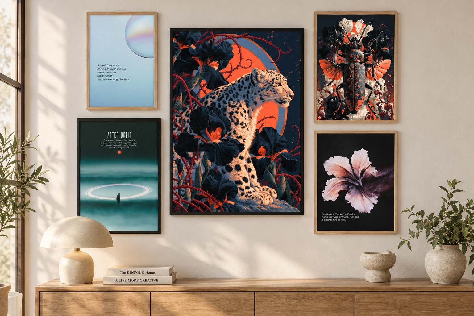
Start with the piece that should attract attention first. This is your anchor: usually the largest, darkest, brightest or most detailed poster in the arrangement. The other artwork does not need to copy it, but it should support at least one part of its visual language.
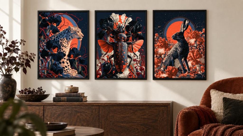
A graphic design such as Busy Signal can anchor a playful retro wall through its strong shape and color. For a darker arrangement, an atmospheric animal portrait from the Velvet Menagerie set can establish the mood before you add quieter supporting prints.
2. Choose One Reason the Artworks Belong Together
A gallery wall can contain different subjects and styles. It only needs one or two repeated elements to feel intentional. Look for:
- A shared color appearing in each print
- A similar dark, calm, playful or nostalgic mood
- Repeated circles, curves, florals or geometric forms
- The same vertical orientation or frame finish
- A theme such as music, food, nightlife or surreal nature
For example, Stay for Side B, Side B and Needle Drop use different compositions but share a music-inspired story. Together they can turn a desk, listening corner or bedroom wall into a personal display.
3. Decide Between a Coordinated Set and a Mixed Gallery Wall
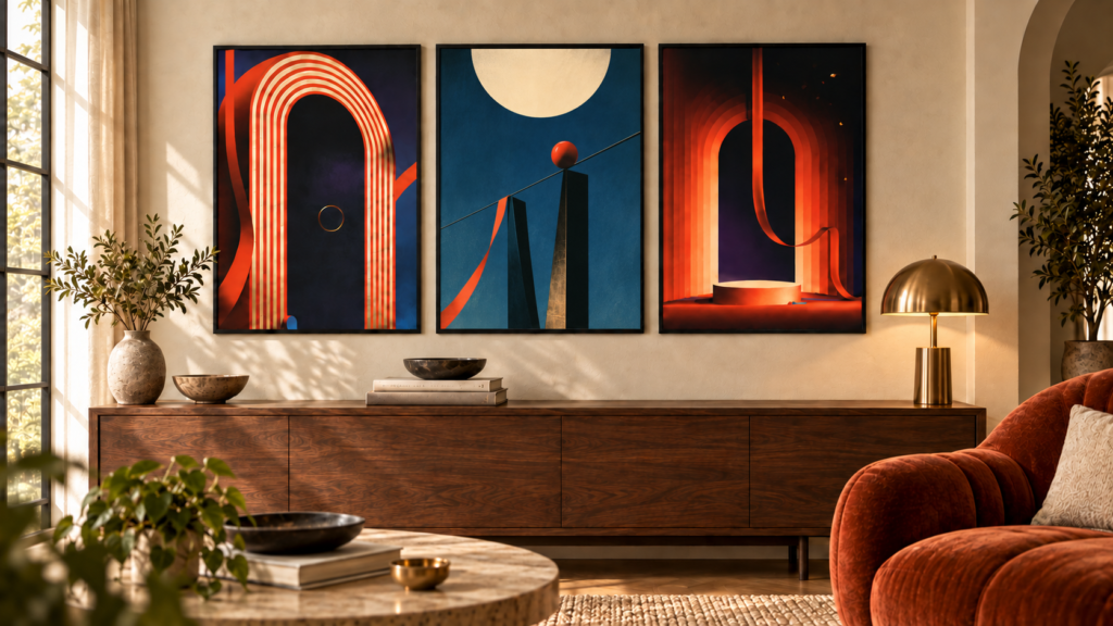
A coordinated poster set is the simplest route because the colors, scale and mood have already been designed to work together. The Signals From Elsewhere set creates a calm surreal arrangement, while After Hours brings warmer color and a playful cocktail theme.
A mixed gallery wall feels more collected and personal. Start with three pieces rather than trying to fill the complete wall at once. Add another poster only when the composition needs more width, height or visual contrast. If you prefer artwork already connected by color and mood, read how to choose a poster bundle or browse the current digital poster sets.
4. Pick a Gallery Wall Layout You Can Repeat
Choose the layout according to the wall and furniture rather than the number of prints you own. Three reliable arrangements cover most spaces:
| Layout | Works Best For | Easy Starting Point |
|---|---|---|
| Straight row | Above a bed, sofa, desk or sideboard | Three equal vertical frames |
| 2 × 2 grid | Square wall areas and clean interiors | Four matching frame sizes |
| Relaxed cluster | Hallways, reading corners and creative rooms | One anchor with two or three smaller pieces |
A straight row feels calm and architectural. A grid creates symmetry. A relaxed cluster gives you more freedom, but it still needs an invisible boundary: imagine one large rectangle around the complete arrangement and keep every frame inside it.
If you choose three matching pieces, the three-piece poster styling guide includes more layout options for wide walls.
5. Choose the Poster Sizes as One Complete Arrangement
Do not judge each print separately. Measure the total width and height of the framed composition, including the gaps. Above furniture, the complete gallery wall should usually feel visually connected to the bed, sofa, desk or sideboard below it rather than floating in the middle of the wall.
One medium anchor with two smaller supporting prints creates a natural hierarchy. Equal frames create a calmer result. Before printing, compare the available dimensions in the poster size guide and measure the outer frame—not only the artwork inside it.
6. Keep the Gallery Wall Spacing Consistent
For most gallery wall layouts, begin with approximately 2–4 inches (5–10 cm) between neighboring frames. A coordinated trio can sit slightly closer, around 2–3 inches (5–8 cm), so the pieces read as one composition.
Large gaps make the posters feel unrelated. Gaps that are too narrow can make detailed artwork feel crowded. The exact measurement can vary, but the visual rhythm should stay consistent across the arrangement.
7. Test the Layout Before Making Holes
Lay the framed prints on the floor first, or cut paper templates matching the outer frame dimensions and attach them to the wall with removable tape. Stand across the room and check the complete shape rather than focusing on one frame at a time.
- Check whether the arrangement relates to the furniture below it.
- Make sure the visual weight is not concentrated on only one side.
- Leave enough negative space around the complete group.
- View the wall from the doorway and from the main seating position.
This quick test is more useful than repeatedly measuring a layout that does not feel right in the room.
Gallery Wall Ideas for Different Rooms
For a Bedroom
Use atmospheric artwork and a restrained palette to keep the room restful. Signals From Elsewhere can form a clean three-print row above a bed or dresser, while a mixed arrangement can combine one darker focal piece with two softer abstract prints.
For a Kitchen or Dining Area
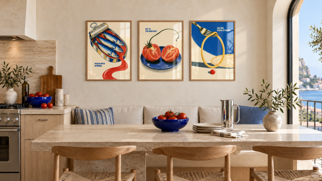
Food and drink imagery can feel playful without becoming novelty decor. Combine Red Ripe and Open Tin with one complementary kitchen print, or use After Hours for a coordinated home-bar display.
For a Music Corner or Creative Studio
Use a shared subject rather than perfectly matching colors. Cassette, vinyl and listening-room imagery can work together because the theme creates the connection. A mix of black and natural wood frames can make this type of wall feel collected over time.
Frequently Asked Questions
Do all gallery wall frames need to match?
No. Matching frames create a cleaner result, while mixed frames feel more collected. If you mix finishes, repeat at least one color or material so the arrangement still feels connected.
How many posters should a gallery wall include?
Three pieces are enough to establish a clear arrangement. Four work well in a grid, while five or more suit a relaxed cluster. The available wall area matters more than reaching a particular number.
Can a gallery wall use only vertical posters?
Yes. Repeating the same vertical orientation creates rhythm and makes alignment easier. Variation can come from the artwork, frame colors or print sizes instead of changing orientation.
Build the Gallery Wall Gradually
A gallery wall does not need to be completed in one day. Start with an anchor, add two compatible prints and live with the arrangement before expanding it. A wall that grows around artwork you genuinely like will feel more personal than one assembled only to fill empty space.
Explore all Coolecto digital poster downloads, browse the current coordinated poster sets or visit the Coolecto shop to find artwork for your own gallery wall.
Bring the idea to your wall
Explore expressive poster art and coordinated sets for modern, personal spaces.